SetSkill

Online learning that adapts to you
Context
Our professor gave us 3 weeks to complete the final group project; we had to create and pitch a mobile app we designed based on a prompt. However, through an unexpected turn (aka the feedback we got from our "mock" pitch in class about liability risks <.<), my group needed to restart with an altered prompt. Having only 1 week left to spare (and an all-nighter to pull), we created SetSkill!
Team
2 Designers
3 Researchers
Skills
Prototyping
Wireframing
User Research
Product Thinking
Visual Design
Usability Testing
Duration
1 Week
Tools
Figma
OBS
Google Sheets
What is SetSkill?
SetSkill is an online learning app that adapts online curriculums to allow users to learn at their best. Using AI technologies, SetSkill can take a submitted curriculum and create additional materials so that online learning remains engaging and beneficial.
Problem Space
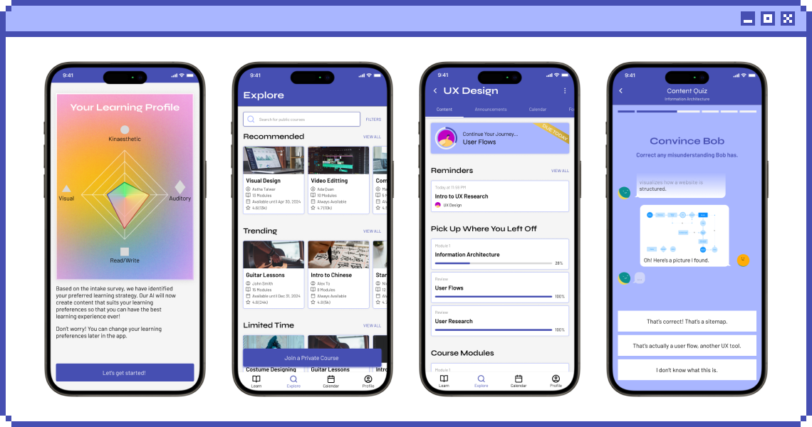
Online courses often only utilizes one or two senses and are not flexible, which make students struggle to locate their strengths and weaknesses.
The Goal
Design a mobile content-delivery app that allows users to learn with different styles through the power of adaptive AI.

> Define

User Interviews
We first set out to reach our goal of interviewing at least one person each, using a list of questions we jotted down. These were some of the questions we asked:
  • What was some of the stressors you have experienced from course-based apps?
  • Have you ever had any bad experience with the online course that you did?
  • What would you personally like to see these apps or services do that has not been mentioned?
Discovered Pain Points
After the interviews, we realized that there were three major pain points with the current online course applications:
  • Online learned material is often not retained due to unengaged learning.
  • The online courses do not offer opportunities to apply the material.
  • Due to unengaged learning structures, many users found more success when sourcing outside material and teaching themselves the course contents.
Personas
A group member created a list of potential personas for us to choose from. The two personas at the bottom were chosen out of the list because we felt that it encapsulated our target audience the most.

> Ideate

User Flow
As the other designer and I were thinking of what the app should have, I soon realized that we had some conflicting ideas of how the user journey should look—we had different mental modals of the product. To solve this, I requested that we make a user flow to have a visual understanding of what each screen or interaction should do in our app. This is what we came up with:
Wireframe
Once the user flow was established and agreed upon, we started making our mid-fi wireframes (due to our one week deadline). After linking all the screens together through prototyping, we began our usability testing.
Key Frames
Engaging Learning
Users will complete an intake survey to see their learning profile and get a better understanding of their learning preference. Using that result, every course content will be formatted using AI to help optimize users' learning. If the users want a different style of content, they can change it to which ever they like.
Applying Learned Material
Users have the chance to do practice questions at the end of each chapter content. Additionally, gamified content quiz will appear at the end of each module to help users better apply and engage with the learned materials.

> Usability Testing

Summary
I was able to find five participants varying in gender, age, and background to help test the mid-fi prototype virtually. I would ask each of them to perform a list of prompts and requested that they verbally explain what they were thinking while performing it. I recorded the sessions using OBS in order to capture their full click path, which helps me understand where their expectation of elements should be placed in. All my observations of their behaviours or issues, and any significant quotes they said during performing the task were jotted down as well using Google Sheets.

Here were some of the prompts that I asked them:
  • Figure out and enroll into a private course.
  • Figure out how to change the content to a more visual layout.
  • When you clicked into your current courses page, did you feel overwhelmed by the layout and information? If you saw this, would you know what to do to increase course progression or review materials?
Findings and Iterations
1. Users found it difficult to enroll in private courses
  • 4 out of 5 participants were unable to enroll into private courses
  • The 1 participant that was able to do it had to click around to figure out how
  • “I don't think I know how to do this, what you're asking of me.” (Participant A)
2. Users had difficulty finding the discussion forum
  • 3 out of 5 participants could not find the discussion forum
  • 2 out of 5 participants had to search around the app to find it
  • “I assume it would be one of the top headers within the course, or within the dashboard/content page." (Participant E)
3. Users wanted to easily access the course outline/calendar
  • 3 out of 5 participants suggested an easily accessible calendar or syllabus to know what content to learn ahead of time
  • “I would appreciate, like if there was a calendar [in the app], because finding the deadlines within modules are like 'where is all the info?'” (Participant C)

> Design System

Some Key Components

> Solution

Engaging Content through AI-Adaption
Depending on what users get on their learning profile (made from the intake survey), the AI will format every course content and practice question to suit it. If users want to change the format style, they can simply do that through a dropdown. Hence, content-delivery and practice questions will be more engaging.
Gamified Learning Application
Users will be able to apply learned content materials through engaging, gamified content quizzes. After completing the quiz, any topics the users had difficulties with will be added into review for them to look back on.  
Variety of Online Courses
While users can join a private course made by their professors, tutor, etc., they will also have a variety of open/public courses to choose from as well!
Stay on Track with Content
Users can see when each content should be read within the course page itself. However, if users want to see all the deadlines from all their courses, the calendar tab will provide that information.

> Takeaways

What I Learned
  • An entirely new problem statement can be found within the original problem! This project/quest was an unexpectedly great way to challenge our group into being as flexible as we can with the little time we had left, after realizing we had to pivot from our intial prompt due to liability issues.
  • Everyone has a different mental modal of how the user journey may go. The user flow really helped our group stay on the same page, and have a greater understanding of what the screens we designed needs.
  • Embracing feedback allowed us to pivot and create an even better product than what we initially planned! Hearing the comments about our first mock pitch really helped us flesh out our ideas more.
  • It is possible to make, reiterate, and pitch an entirely new product design in one week! :'D (I was fortunate to have the group members I did)
Next Steps
  • Gather more user data (another round of usability testing)!
  • Explore more ways to improve online learning.
  • Explore partnerships or collaborations with educational institutions, organizations, or companies.
Hope you enjoyed the quest's journey as much as I did!