Ready Up

A better start to gaming
Context
This was a personal project done for the Google UX Design Professional Certificate online course, where it was peer-reviewed. Ready Up is a fictitious arcade company made for the prompt.
Team
Me!
Skills
Prototyping
Wireframing
User Research
Persona Mapping
Competitive Analysis
Product Thinking
Visual Design
Acessibility Design
‍Usability Testing
Duration
3 Months
Tools
Figma
Miro
OBS
Google Sheets
What is Ready Up?
Ready Up is an arcade located in the urban areas. With such a busy environment, Ready Up strives to optimize user experiences at the arcade by preparing a preview of all the game machines offered at the location. Ready Up targets customers that are competitive or whom like to go out with friends and family.
The Problem
Customers can be overwhelmed by the wide variety of games and unknown information when entering an arcade.
The Objective
Design an app for Ready Up that allows users to preview games offered at the arcade.

> Understanding the User

Summary
Some initial assumptions I made going into user research was that the primary user group going to arcades are friends and family who like spending time together by being in a new, fun environment.

After conducting interviews, a persona was created to help direct the path of the app's design, depending on the users' needs.

It seemed that these user groups confirmed the initial assumption about arcade customers, however, the research also revealed that users had a lack of information on most game machines. This would create an unpleasant experience for users at the arcade, as there are information asymmetries.
User Pain Points
Persona
Problem statement: Shawn Willow is a busy teacher that wants to spend time with his family, who needs information on attractions because he wants to budget and make sure his family will enjoy going there.

Goal statement: Our arcade game preview app will let users know the basic information of each game in the arcade, which will affect friends and family who frequent arcades by allowing them to determine their budget or whether this arcade is right for them.
User Journey Map
Mapping Willow's user journey showed how useful and time-saving it would be to have the Ready Up arcade preview app.

> Competitive Analysis

Summary
I looked into several competing companies, having a range of direct and indirect competitors, with the goal of comparing the information/preview given for their attractions and the navigation experience for users. After noting their general information, my first impression of their website and mobile experience, interactions, visual design, and content within the competitive audit, it seems that these features are beneficial to include within the Ready Up game preview app:
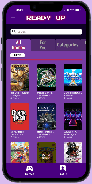
  • Descriptions that are short and to the point
  • Filtration option within game page
  • Visuals such as images and icons for accessibility
Competitive Audit
Scroll through the audit to see my full analysis of the three chosen competitors.

> Starting the Design

User Flow
User task: Use the arcade game preview app to see games offered at the arcade and their information
Paper Wireframes
Multiple wireframes were drafted for each possible screen in order to assess what elements would be necessary and well-suited to address the user pain points. For example, while designing these multiple homepages, I tried to prioritize showing some quick game information within categorical selections so users can roughly determine whether they would like the game.
Stars were used to mark the elements that would be used in the initial digital wireframes.
Digital Wireframes
The paper wireframes were transfered to Figma, and I continued to make sure that my design decisions were directed by my findings from the user research.

The primary user flow was between the homepage, game page, and game info. “News” and “Profile” acted as an extra add-on, which allowed users to personalize the app, and can stay connected with the arcade too. A usability study was soon conducted with users.

> Test and Refine

Summary
I conducted two rounds of usability studies. The first study helped guide additional design choices from digital wireframes to mockups. The second study used a high-fidelity prototype to further reveal what needed to be refined or changed again. I used Miro and Google Sheets to take note of their any significant quotes, attitude, and click path.
Overview
Research Questions:
  • Are there any information or features that are missing that users would like added to the app?
  • How long does it take users to navigate the app and find desired games?
  • Are users finding the app easy or hard to use/navigate?
  • What can we learn from the user flow, or the steps user took navigating the app?
Participants:
  • 5 participants: 2 males, 2 females, and 1 non-binary individual between the ages 18 and 30
Methodology:
  • 15 minutes per participant
  • Canada and United States, remote
  • Unmoderated usability study
  • Users were asked to perform task on a low-fidelity prototype
During Usability Study
Go through the tabs of participants to see their progress through the usability study.
After Usability Study
I used Miro to help group some reoccuring theme I saw between the participants.
Round 1 Findings
  • Users want a more intuitive way to reach personalized sections.
  • Users want better cues to know if their selections are applied in filters.
  • Users expressed an interest for a like/save function to revisit or check out the games later.
Round 2 Findings
  • The user flow is not clear with too many added features.
  • Users want a reset button within the filters selection.
Key Reiterations

> Solution

Quick Searching
Users can easily see the number of coins needed, players, and machine operation status before going into the game's information page! Additionally, users can search, filter, or go through the categorization tab to see specifically if the game they had in mind is available at the arcade.
Game Information
Users can easily click into a game to see more detailed information on the game, including its genre, description, leaderboard, ratings, and even see how to play it! On this page, users can also add the game to their "like" list.  
Easy Navigation
There are multiple ways for users to get from pages to pages. This helps them to be more flexible on the app and get to where they want to be conveniently!
Accessibility Considerations
Colours
Foreground and background colours are specifically chosen to ensure it passes the WebIAM colour contrast test.
Icons
Used icons to help make navigation easier.
Animations
Every animation between screen transitions are between 150 ms to 500 ms, which is recommended by W3C.

> Takeaways

Impact
The app makes users feel like Ready Up optimizes their arcade experience by preparing them in advance for what to expect.

One quote from peer feedback:
“If I were to go to an arcade, an app such as this would be very resourceful to prepare for my time out. You’re basically saving me time!"
What I Learned
While designing the Ready Up app, I learned how the design process is used in product development! It was clear to see how important it is to conduct user interviews and usability studies in order to know what direction I am taking my designs in. Additionally, a lot of revisions were made throughout this all, so the first idea is never the last.
Next Steps
  • Conduct another round of usability studies to ensure the user pain points are addressed.
  • Conduct more user research to see if any needs were missed the first time.
  • Further develop intended features to show on hi-fi prototype (like leaderboard and/or the user's like section).
Hope you enjoyed the quest's journey as much as I did!